AI App Icon buying guide: can you still recognize the mark at 24 pixels?
Compare generated and hand-drawn concepts at the same small sizes before preparing a Google Play asset.
AI App Icon turns text into app icon concepts. Try it when you need fast exploration. If you already have an approved brand mark and just need store assets, adjust it in a design tool. A generated image is not a finished listing asset.
Compare two levels of detail
Use an original fictional hiking app. Brief a generated concept and a hand-drawn one with the same off-centre compass motif and colours. Give them the same canvas and inspect at 144, 48 and 24 pixels. The smaller sizes are internal stress tests, not store requirements. Ask two people who did not draw the concepts to identify the mark among neutral icons. If details turn to noise, the silhouette changes or either person misidentifies it, simplify the outline instead of enlarging the preview.
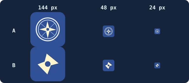
Original illustration, not an output from the tool. The shared background makes the detail and silhouette easier to compare.
Prepare the listing file only after the small test passes
Google Play’s listing spec calls for a 512×512, 32-bit sRGB PNG, full square, without baked-in corners and platform shadows. Rounded corners in this diagram are preview treatment, not a template. Rebuild a clean silhouette in your design tool, check rights and brand similarity, and export. Keep the generated concept only if both people recognize it and end-to-end work is faster; otherwise keep the hand-drawn version. This test does not guarantee store approval.
Content note:This article is based on publicly available information and is intended as a reference for evaluating tools. Features, pricing, and related policies may change at any time; please refer to the latest official information.
Original source:www.aiappicon.com