Choosing ArtiverseHub AI: keep the right third clear for translated titles
Compare abstract layouts at the same aspect ratio and decide whether a fixed SVG will be easier to reuse.
ArtiverseHub AI’s homepage describes using multiple image models in one interface to generate from written descriptions. That makes it a candidate for exploring abstract compositions, not a guarantee that a requested blank zone will stay clear.
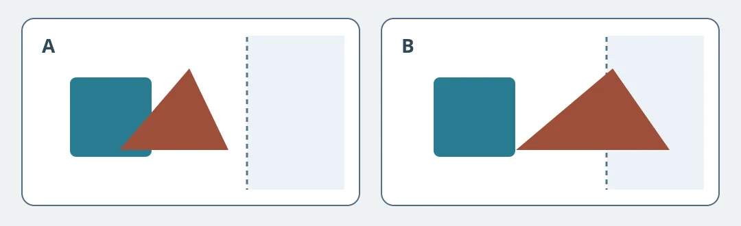
Figure 1. The area to the right is for editable type added later. B fails even if the composition looks fine on its own.
Plan a landscape cover for a fictional prospectus. Keep the same aspect ratio throughout. Write one brief: cyan and brick geometric shapes clustered on the left, no generated lettering, and the right third completely blank. Place both candidates on the same canvas, mark the two-thirds boundary, and see whether any shape or color enters the title zone. Add the title as a separate editable element and preview a longer translation at its actual reading size. A can move to typesetting. B needs a different composition, not smaller type. The figure is an editorial drawing, not tool output.
If the composition follows fixed rules, start with a reusable SVG you draw and keep the art separate from the text. Consider trying different models only if you need distinct arrangements, the same-size comparison yields enough usable options, and the time and cost of retries, selection and typesetting fit the job. This is an exercise with original abstract shapes, not a live run or a commercial rights guarantee.
Content note:This article is based on publicly available information and is intended as a reference for evaluating tools. Features, pricing, and related policies may change at any time; please refer to the latest official information.
Original source:web.archive.org