Bannerbear guide: a long headline fits. Is the event card ready?
Check short and long titles on an original workshop card at two sizes. Keep the title complete and the time and room easy to read.
Bannerbear V5 is worth comparing if you make workshop cards every week with a common design and headlines in several languages. If you make one or two a month and regularly rework long headings by hand, your existing design file may be faster. The goal is not to squeeze words into a box; it is to preserve what people need to know to show up.
Separate text that grows from details you cannot lose
Bannerbear’s changelog lists V5 text-fit modes in February 2026 and responsive templates for multiple sizes in March. Its V5 text-fitting help ties fitting behavior to the text box height. That can help manage space, but cannot tell you whether the smaller text will still be easy to read at delivery size. Nor is it a reason to skip checking a converted older template.
Try an original layout on paper: the short English heading Stencil Printing, the longer German Einführung in den Schablonendruck, and the same details, 14:00 and room B2. Give the headline two lines and place time and room in a separate text area. Check both the wide and narrow cards. If an old layout combines everything in one text area, look for a long heading pushing out event details. Card A loses required content; B is a proposed layout, not a Bannerbear result.
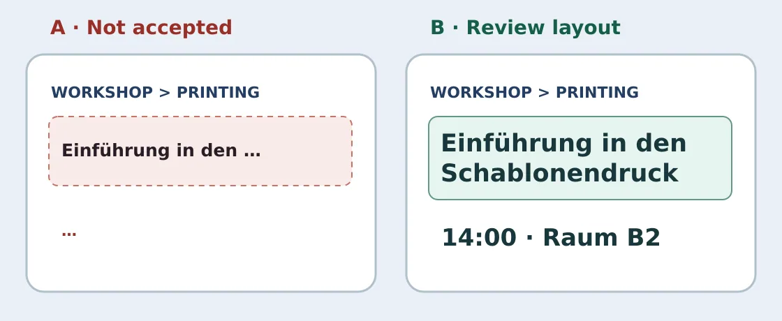
Original illustration, not a screenshot or a product test. B wraps the title and keeps 14:00 and room B2, but still needs a check at final size.
Read at final size before committing to a template
Treat two languages at two sizes as four deliverables. At normal reading size, ask someone who has not seen the input to read the event name, 14:00 and B2 without zooming. Do not let the short title hide a problem with the long one. If the long title only fits at a size noticeably smaller than the card body, give it more space or make a separate narrow layout rather than dropping required text. Use your own sample, not client material. This paper review needs no account, external system or publishing.
Record the time to set up the template, how many edits a new room or font requires, and how many older designs need another review after conversion. A reusable layout is useful if all four outputs pass and the next person knows what to recheck after an edit. If every language still needs its own fixes and manual design means one less layout to maintain, stay with your design files.
Content note:This article is based on publicly available information and is intended as a reference for evaluating tools. Features, pricing, and related policies may change at any time; please refer to the latest official information.
Original source:www.bannerbear.com